Redesign guide signs in a mega station and improving passengers experience
Designer
The Challenges
Reduction of dedicated button actions
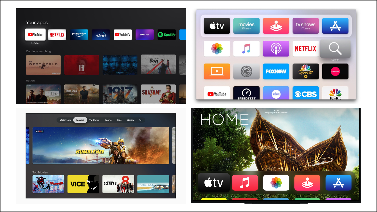
Modern TV media streaming interfaces
Introduction
The PlayStation 4's interface has evolved several times. With modular, card-based interfaces becoming a design trend, and the rise of streaming services (on-demand video and music), PlayStation's interface looks old and outdated.
So after researching modern TV interfaces, I have redesigned the PlayStation interface to make it more modern and user-friendly.
Goals are to:
- Inheriting the classic interaction and UI elements of the PlayStation 4;
- Simplify operation by using only the D-pad/left-stick for selecting whenever possible;
- Modular display of cover and graphic content, unified styling.
Methods
Caution and Moderation
Issue #1 - Reorganize Quick Menu
After reviewing the PlayStation 4's Quick Menu and Upper Menu:
- Too many of the same functions were found;
- Upper Menu is not globally accessible (especially when using a full-screen app);
- Quick Menu provides a not fully customizable set of functions.
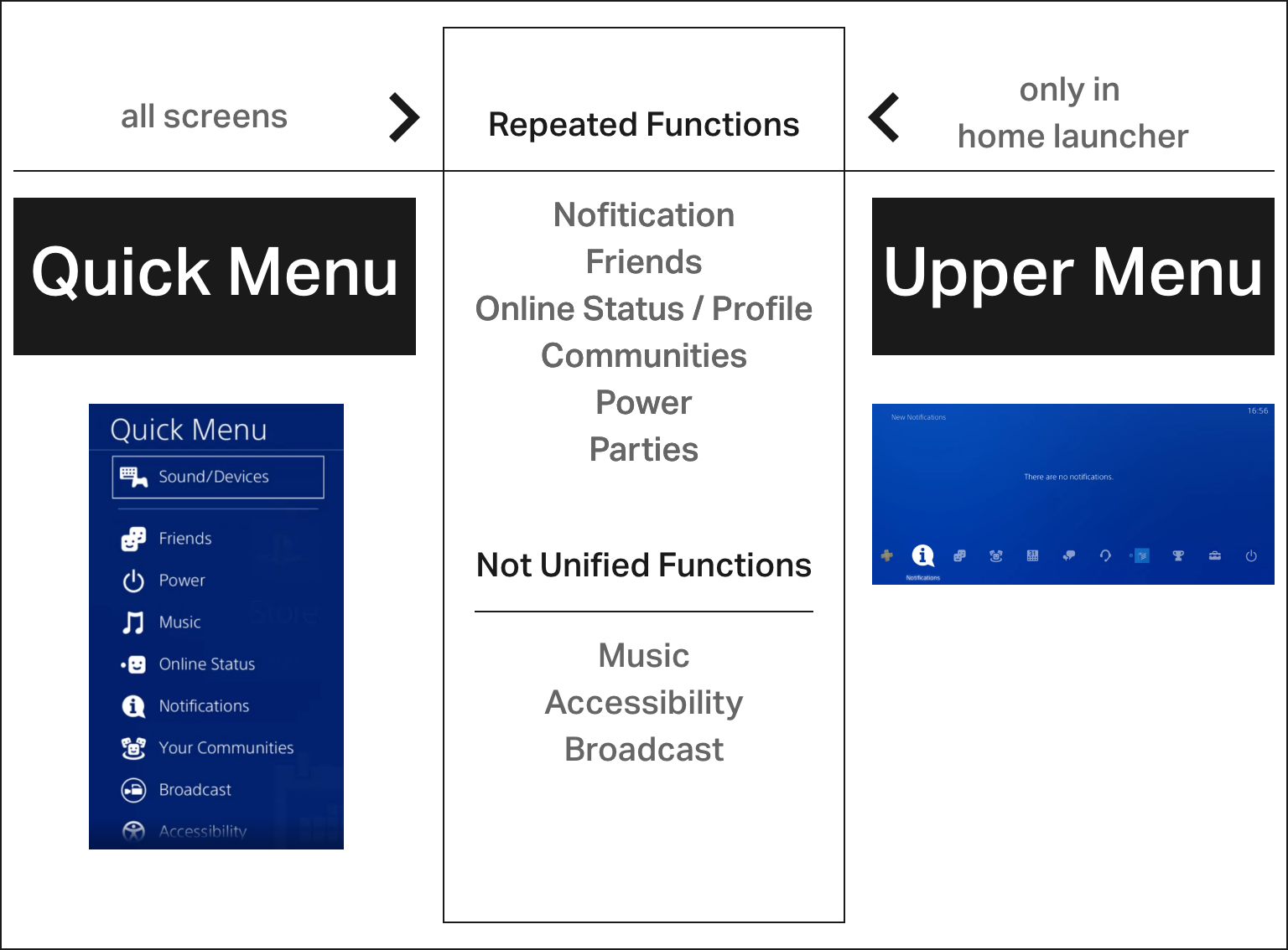
Repeated quick menu functions
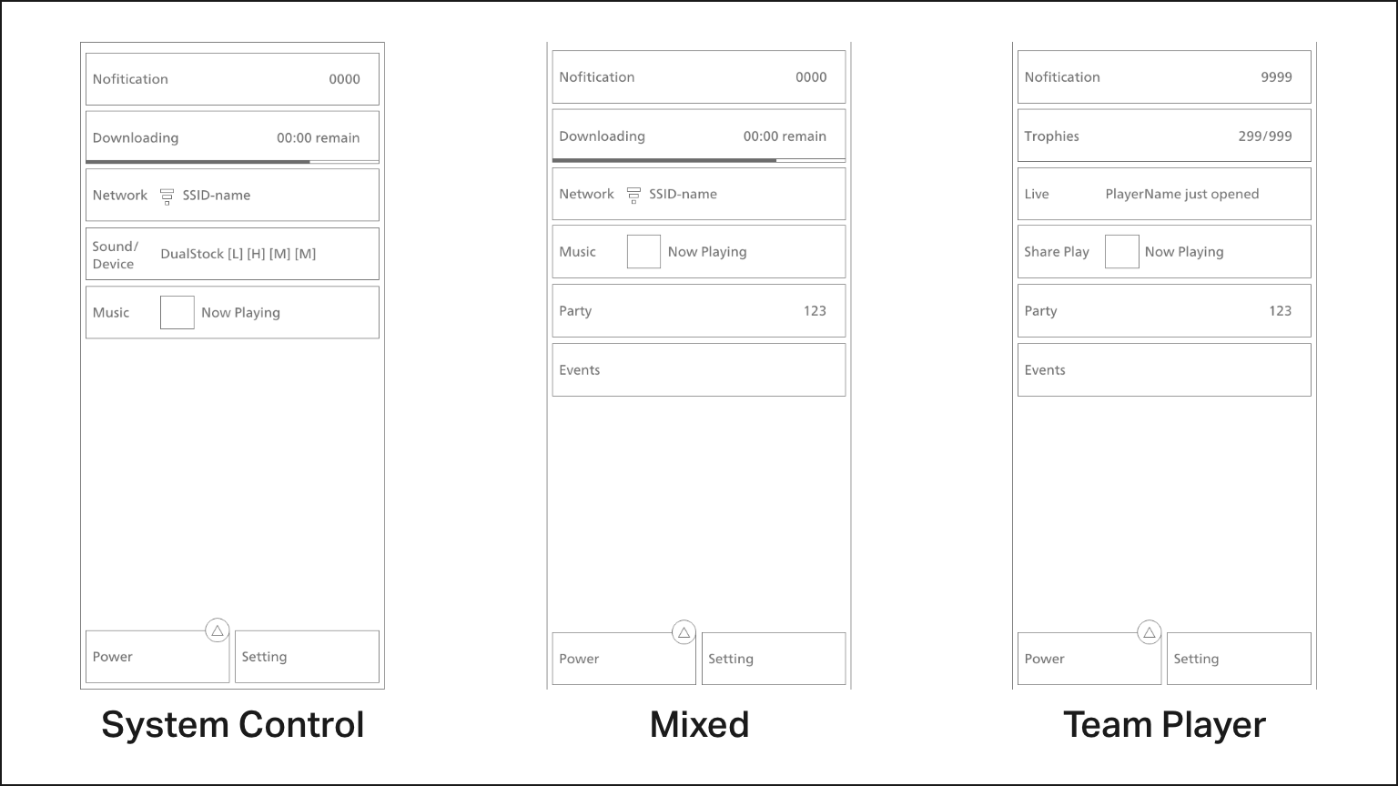
Notification centre after customisation for gamers with different needs
Issue #2 - Extraction of core launcher functions
I've summarised the four core functions that gamers have throughout their PlayStation experience, ensuring that all sub-functions can be categorised:
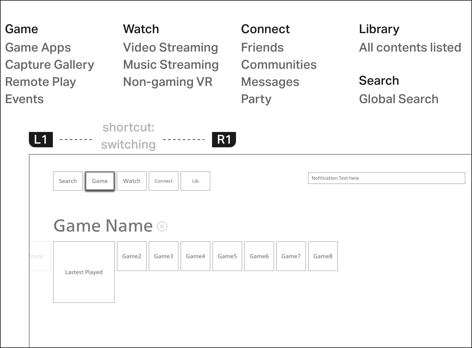
Toggle topbar to quickly switch between core functions
Issue #3 - Universal Cards
Responsive, modular cards can be used for a variety of display types:
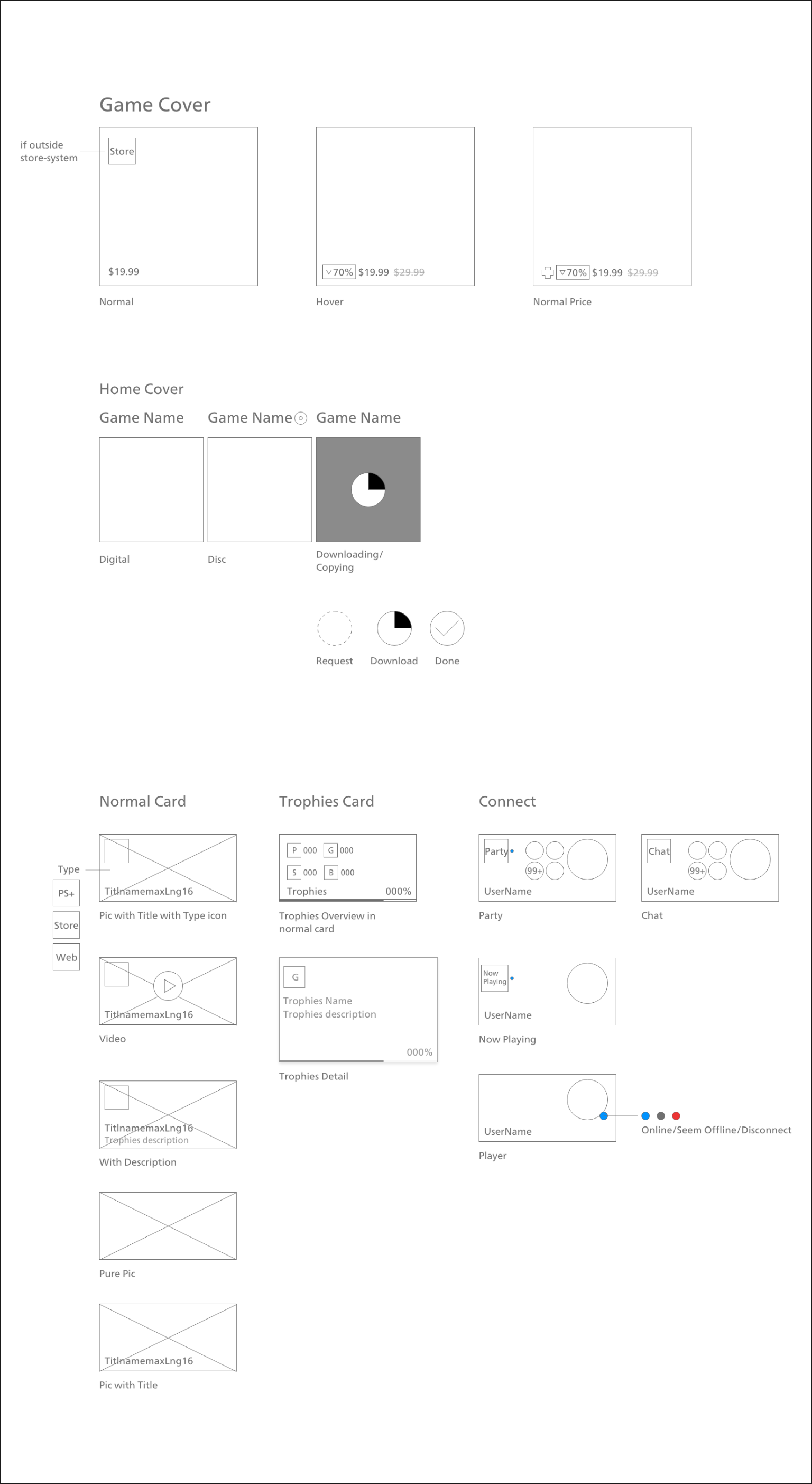
Module Listing
The Final
Graphic design

24-cols grid, 1080p@2x for 4K Hi-DPI interface display


