
Redesign guide signs in a mega station and improving passengers experience
The Challenges
Taming Crowds
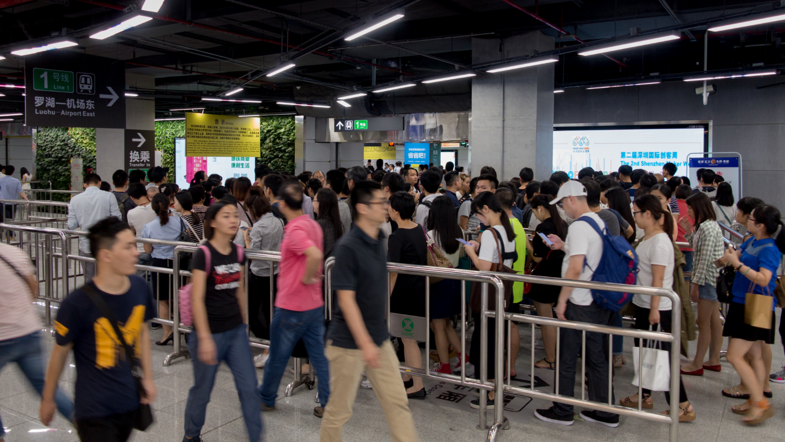
Crowds in rush hour
Introduction
Chegongmiao station is the biggest station in Shenzhen metro system, China (by 2017), which connecting four metro lines.
I received the invitation form Network Operation Center (the "NOC"), Shenzhen Metro Company (SZMC) to help designers improve the in-station sign system. NOC's designers completed the pre-survey first.
According to their pre-survey results, goals are to:
- Respond sign system supplies for crowds flow's guiding;
- Revise incorrect typesetting and graphic mistakes;
- Keep and follow the company's visual style.
My Role & Methods
Unified and Revise
Repositioning signs
Chegongmiao station including two concourses and connected four lines (Line 7/9 joint platform using cross-platform interchange layout, significantly increased passengers cognitive costs), here are the interactional correlations:
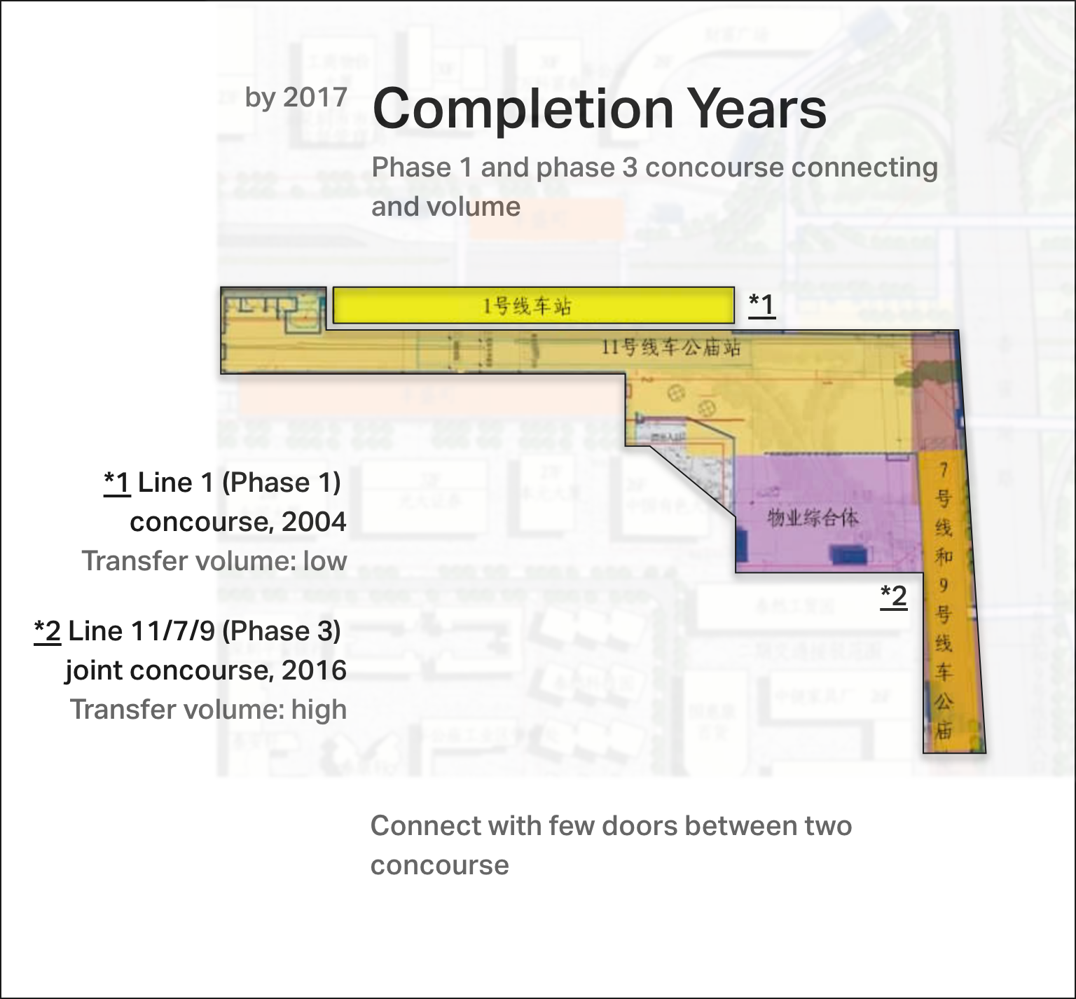
Phase 1 and phase 3 concourse connecting and volume
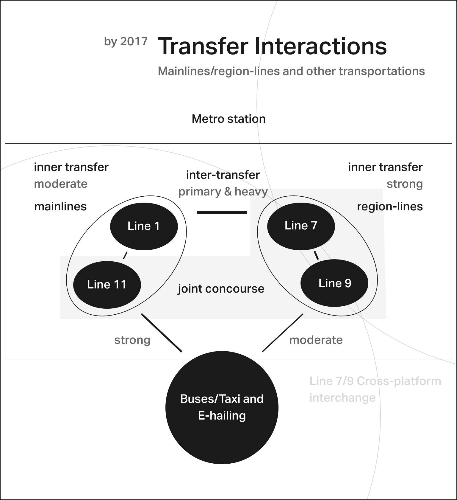
Mainlines/region-lines and other transportation interactions

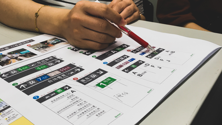
Sorry about this work stilling in NDA's protection so I can't tell you more detail about repositioning signs.
In the former design, the architect can't predict crowds flow accurately, we work with station master/supervision engineer, and all station staff makes the repositioning successfully done.
Graphic design
But I can tell you how to make more clearly sign:
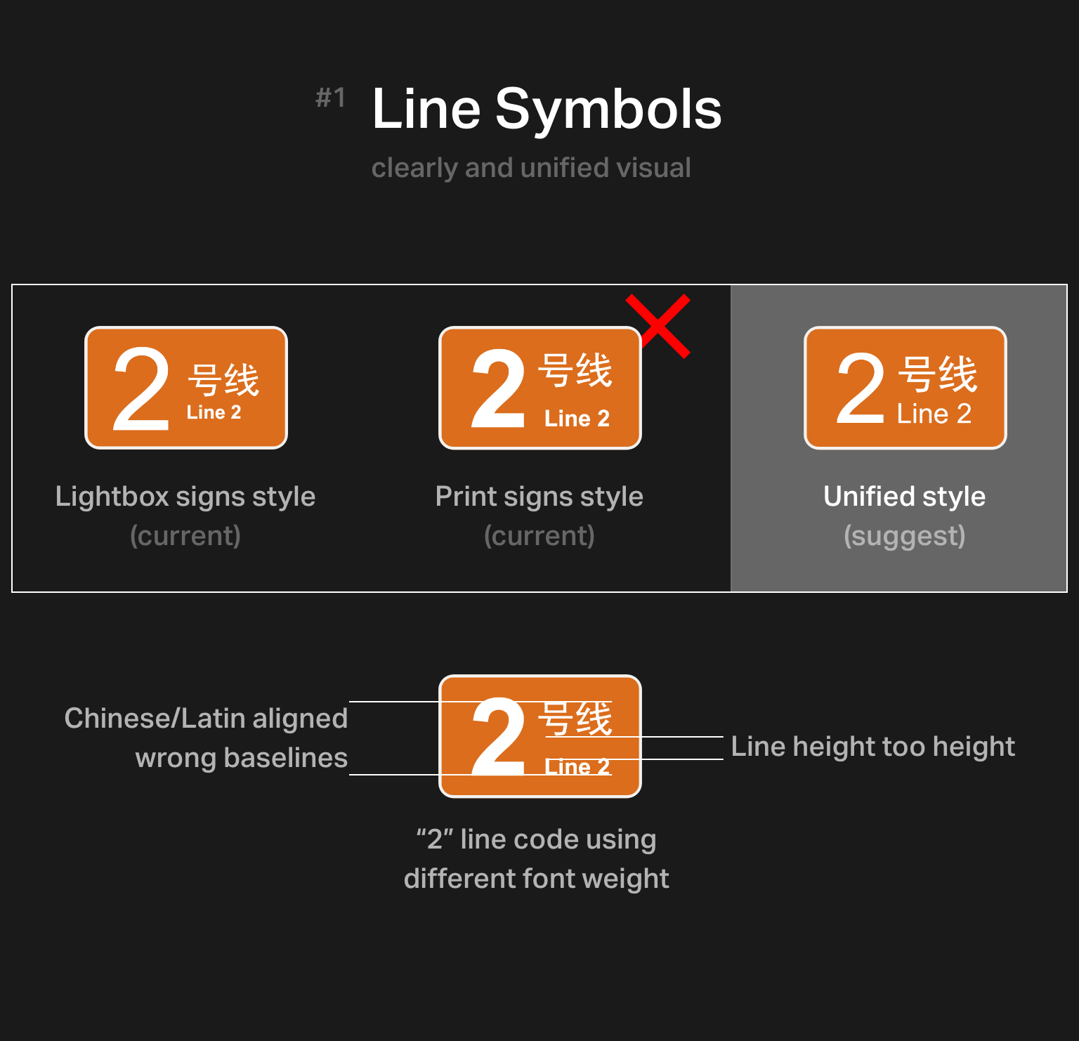
We found (and fixed) many issues in this station's sign system graphic design and typesetting mistakes; those make signs unreadable and look oddly. For example:
- Incorrectly using Latin punctuations and spaces;
- Bad translation;
- Incorrectly spelling Hanyu Pinyin.
Mainlines/region-lines and other transportation interactions
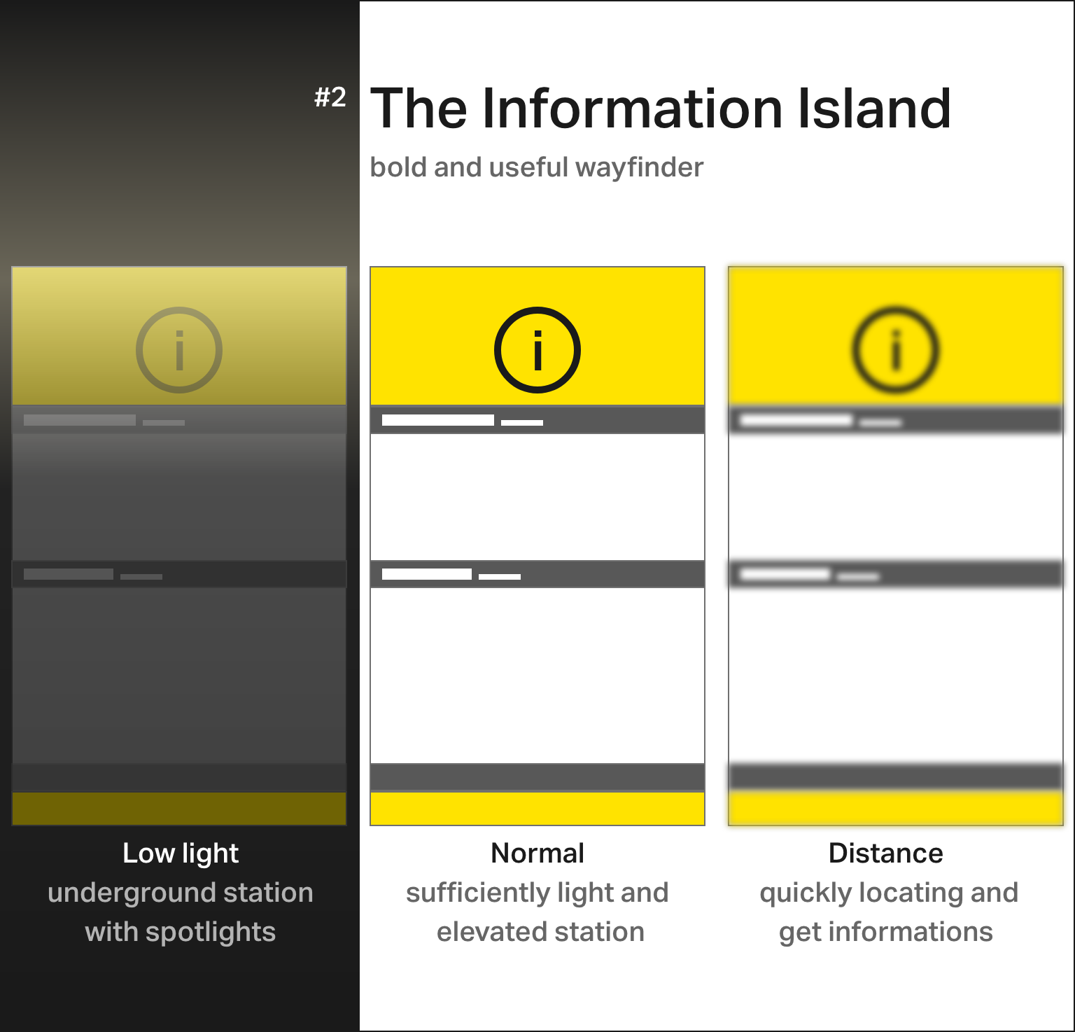
The Information Island - bold and useful wayfinder
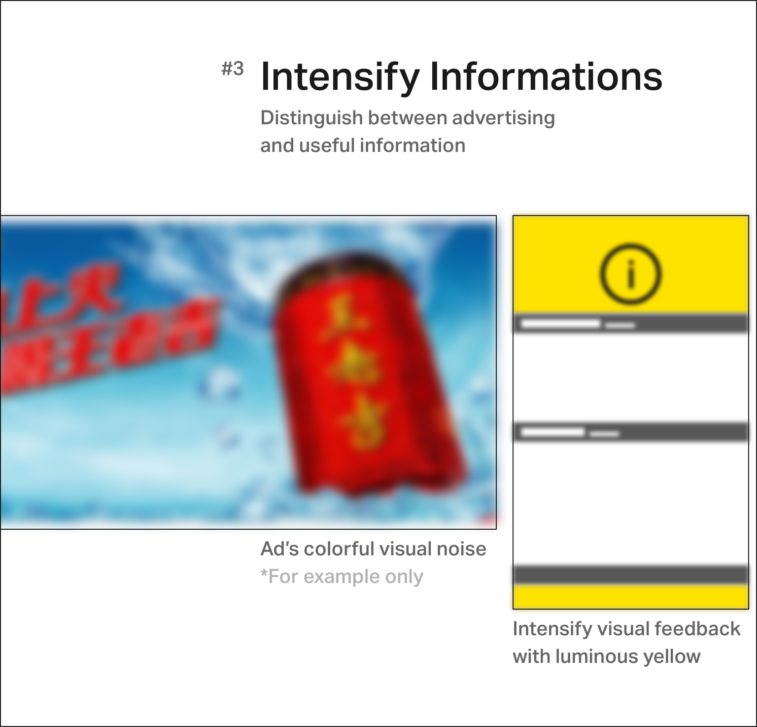
Distinguish between advertising and helpful information
The Final
Better Looks, Better Efficiency
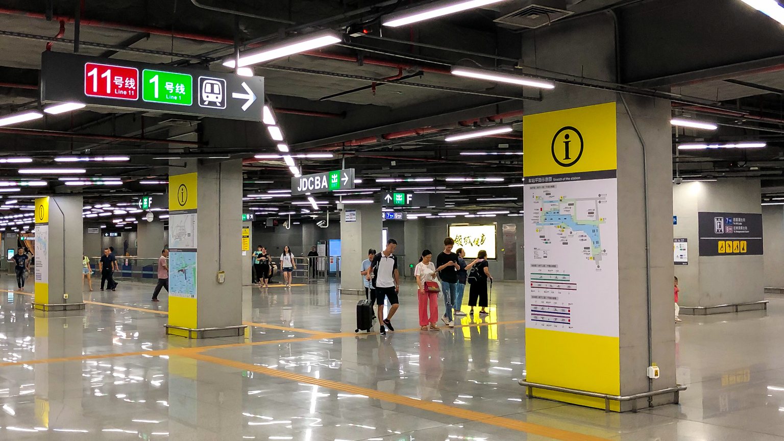
Final signs #1, concourse with all rebuild signs
Final signs #2, "groups of three" for all information
Thanks to all SZMC staffs
https://standardsmanual.com/products/nyctacompactedition
https://tfl.gov.uk/info-for/suppliers-and-contractors/design-standards
http://pinyin.info/readings/zyg/rules.html