Jul 2017 - Aug 2018
Consulting Case for NOC, SZMC
Graphic Adviser
Pre-Press and Graphic Review
CJK/Latin Typesetting Review
Transfer Experience Flow
Redesigning wayfinding signage in a major transit hub to improve passenger flow and experience
The Challenges
Taming Crowds
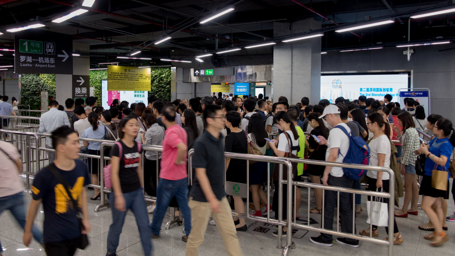
Crowds in rush hour
Introduction
Chegongmiao Station was the largest transit hub in the Shenzhen Metro network (as of 2017), serving as a major interchange connecting four active metro lines.
I was invited by the Network Operations Center (NOC) of the Shenzhen Metro Company (SZMC) to consult on visual styling and layout enhancements for the station's wayfinding system, working alongside internal designers who led the initial user research.
According to the initial user research findings, our goals were to:
- Optimize signage placement to streamline passenger flow during peak hours;
- Audit and correct typographical, alignment, and translation errors;
- Maintain absolute consistency with the company's established corporate visual identity.
My Role & Methods
Unified and Revise
Repositioning signs
Chegongmiao Station features two expansive concourses and connects four distinct metro lines. The joint platform for Lines 7 and 9 uses a cross-platform interchange layout, which significantly increases cognitive load for transfer passengers. Below are the key spatial interactions:
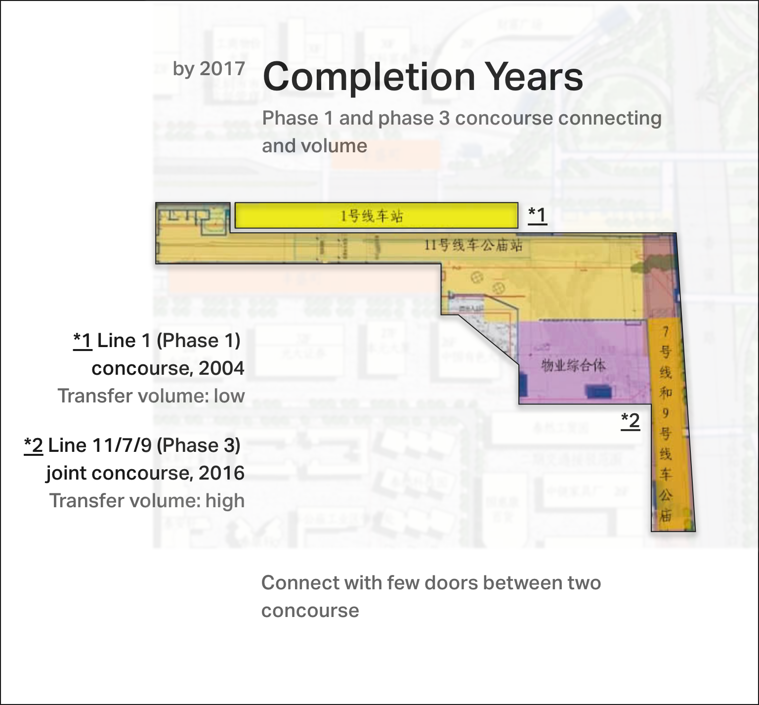
Phase 1 and phase 3 concourse connecting and volume
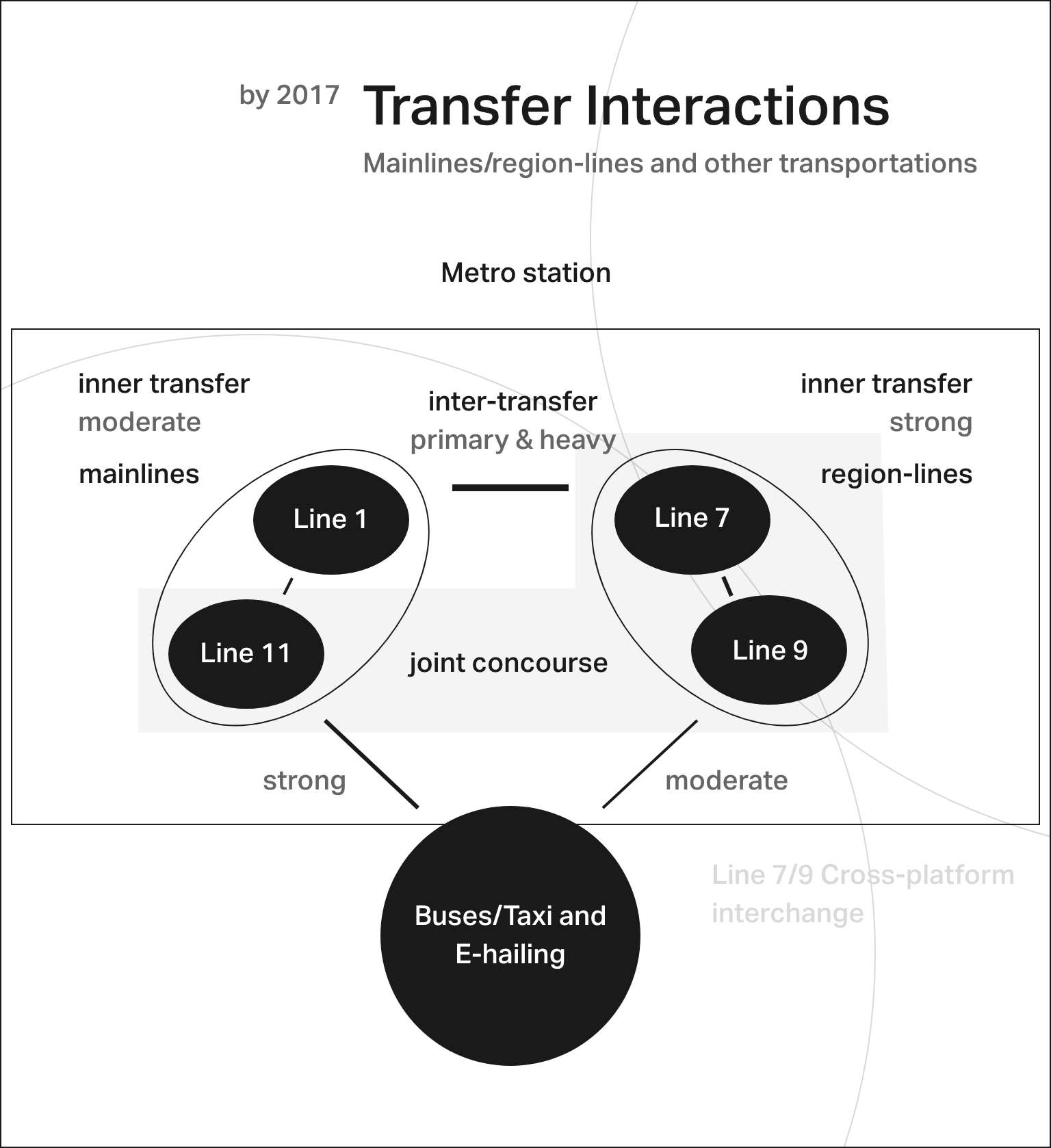
Interactions between core metro lines, regional rail, and local transport networks
Please note: certain aspects of this project are protected by a Non-Disclosure Agreement (NDA), so specific signage layouts and placement details have been omitted.
Since the original architectural layout could not fully anticipate real-world passenger volumes, we collaborated closely with the station master, supervising engineers, and front-line station staff to optimize physical sign placements based on daily operations.
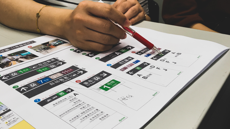
Graphic design and typesetting
However, I can share how we improved signage legibility:
We identified and resolved numerous typographical and graphical errors that compromised legibility and visual consistency, including:
- Inconsistent spacing and punctuation between Latin and CJK text characters;
- Literal or awkward English translations;
- Inaccurate Hanyu Pinyin spellings and capitalizations.
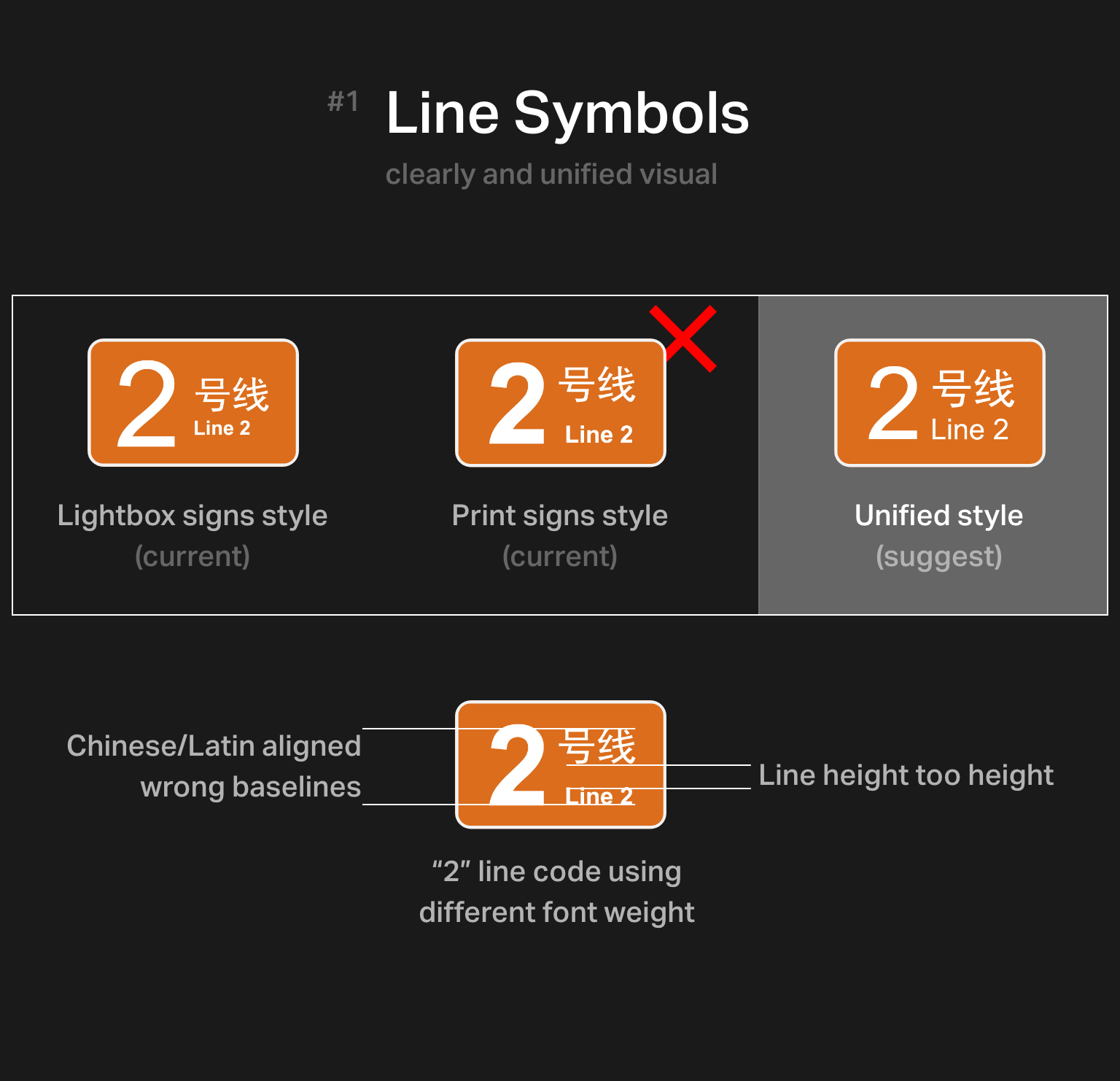
Line symbols and regional transit icons
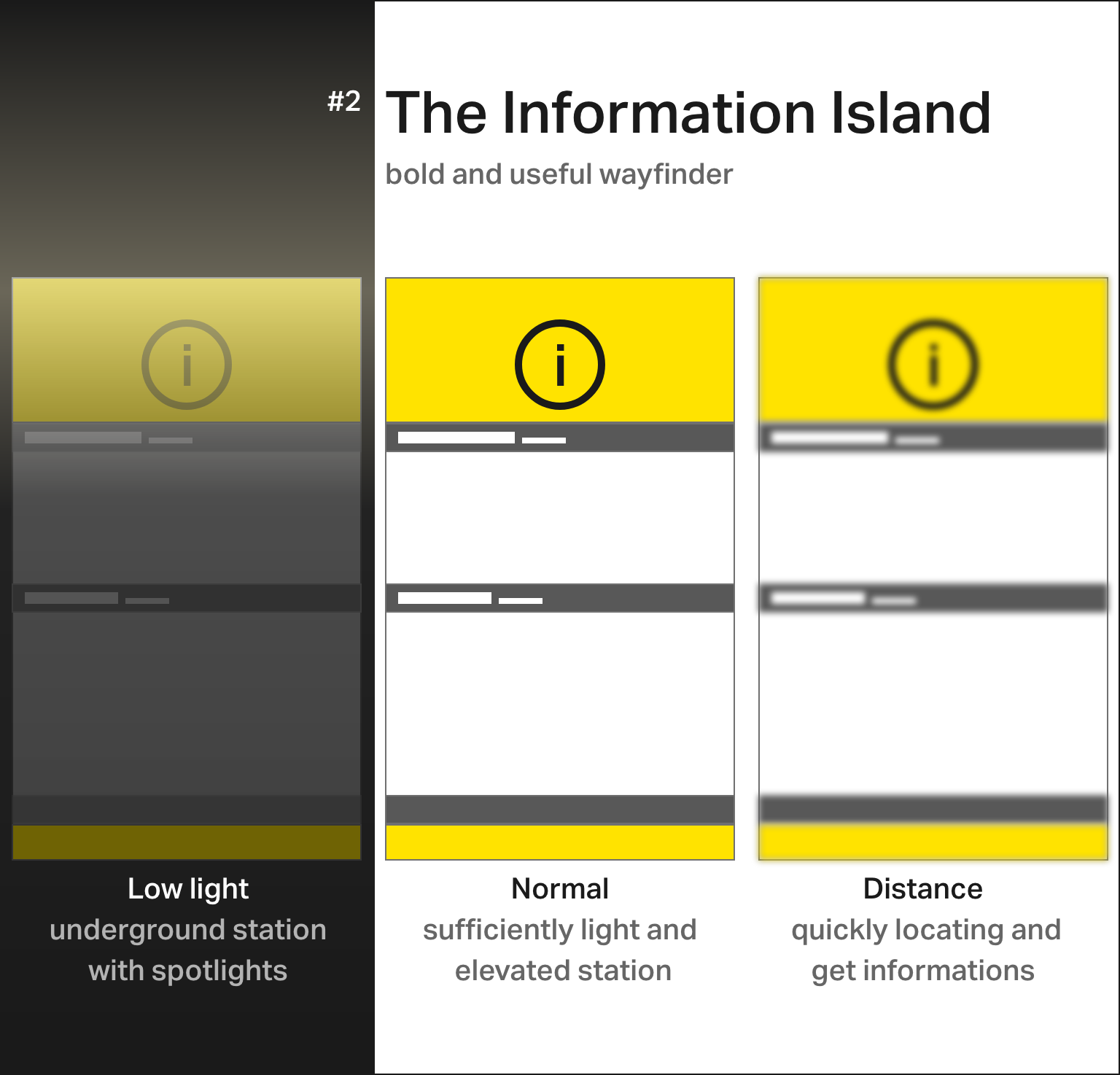
The "Information Island" - a bold, high-visibility wayfinding prototype
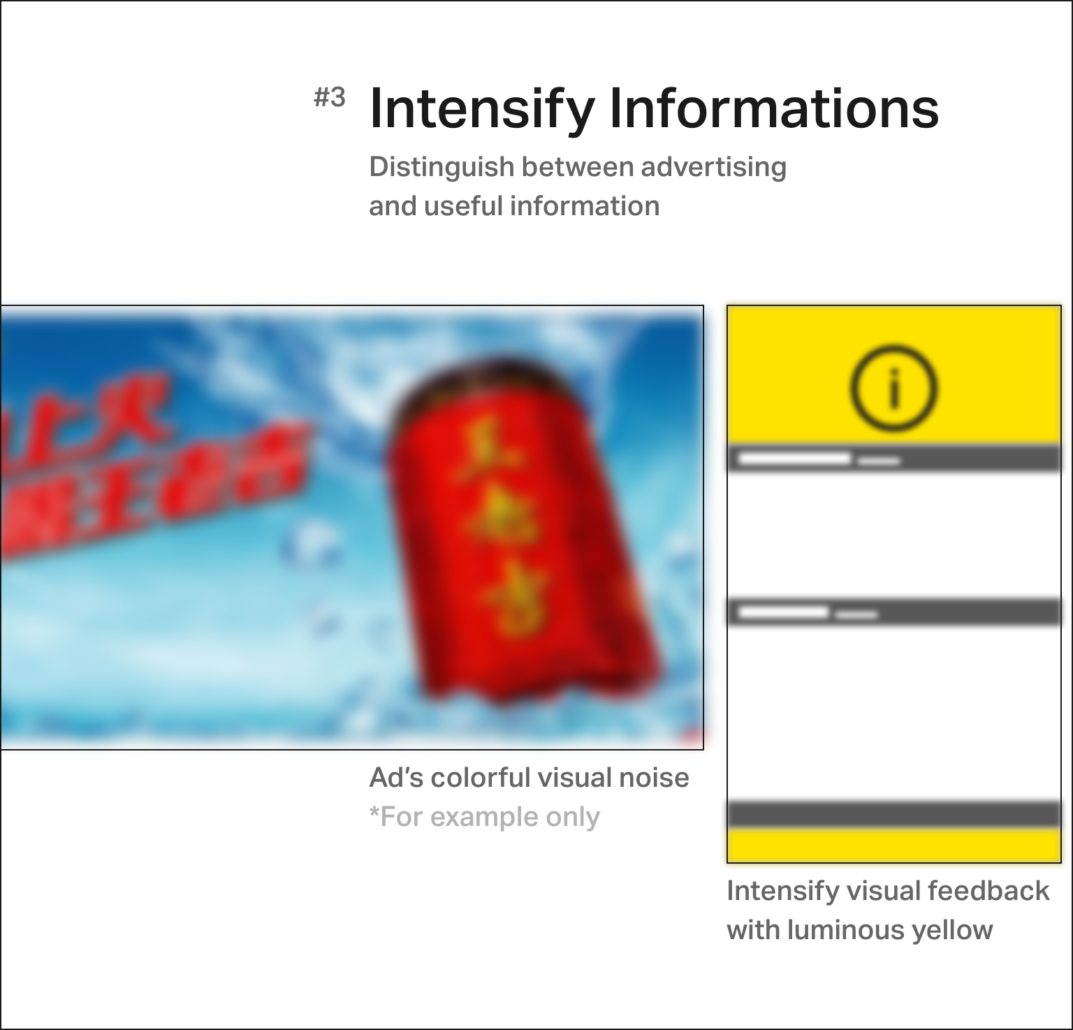
Differentiating helpful wayfinding information from surrounding commercial advertisements
The Final
Better looks, better efficiency
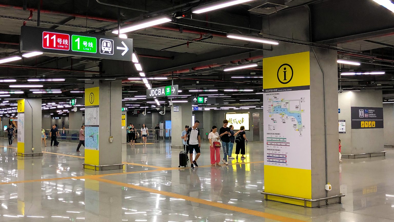
Reconstructed wayfinding signs across the main station concourse
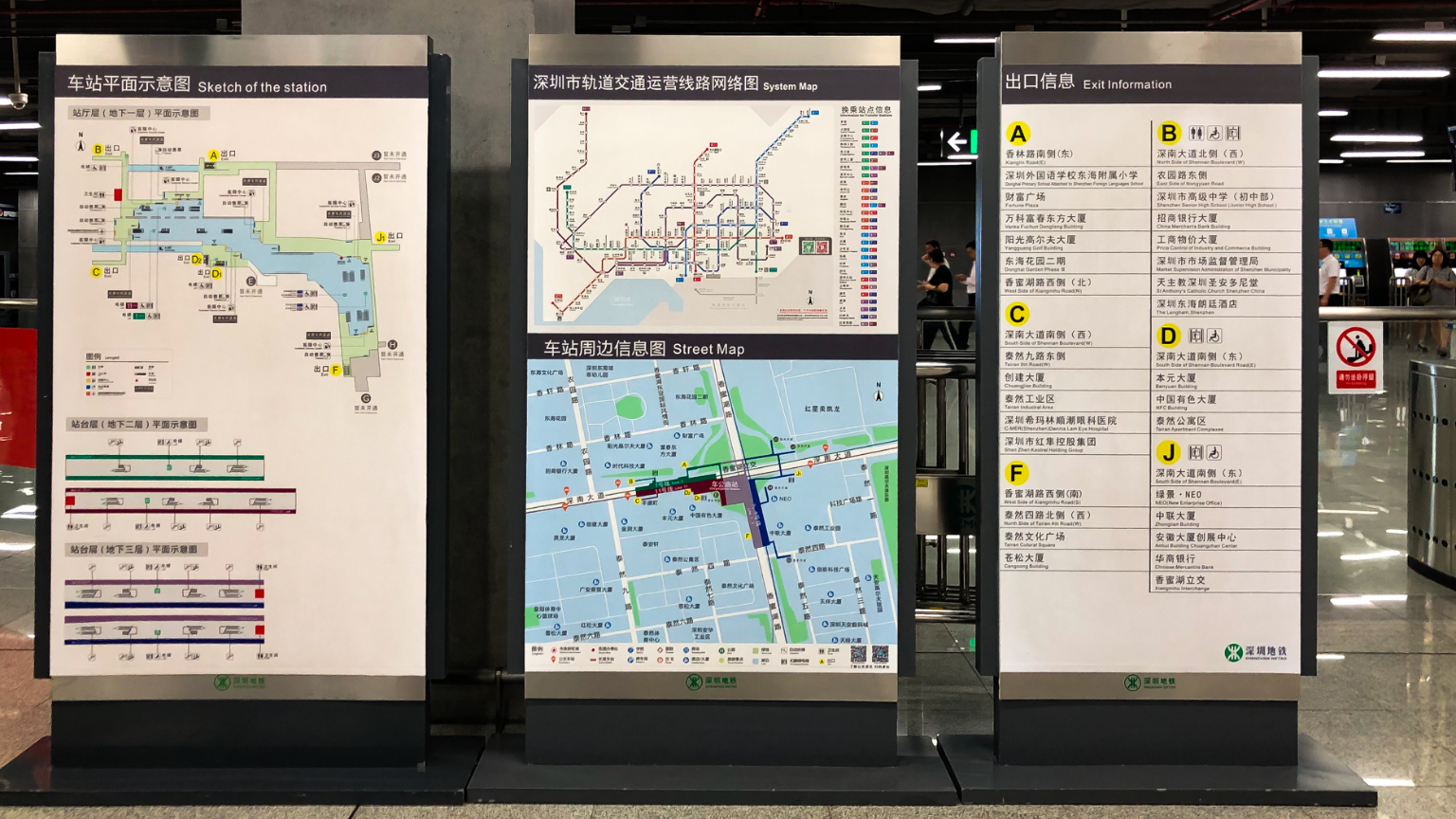
Grouping information in sets of three to optimize readability under transit constraints
Special thanks to SZMC station personnel
https://standardsmanual.com/products/nyctacompactedition
https://tfl.gov.uk/info-for/suppliers-and-contractors/design-standards
http://pinyin.info/readings/zyg/rules.html