Jan 2026 - May 2026
Open Source Project
UI/UX Designer (Redesign & UI Assist)
Vue 3 with TypeScript
Tailwind CSS & shadcn/ui
Docker API & Go Backend
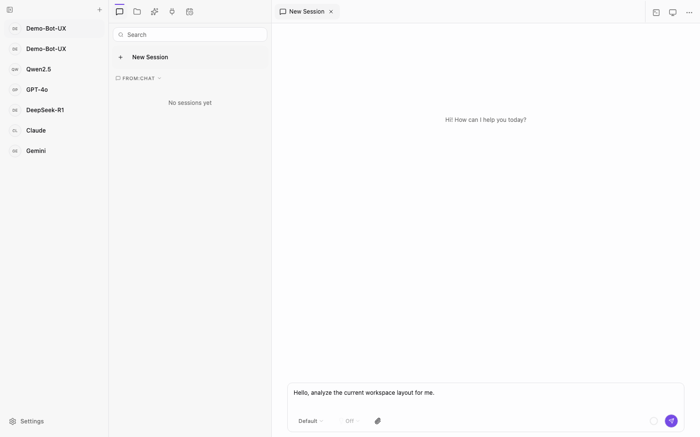
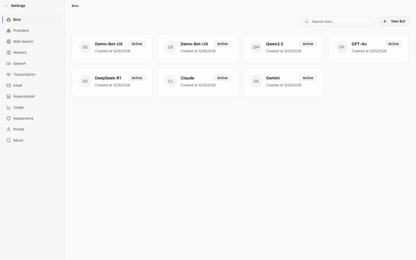
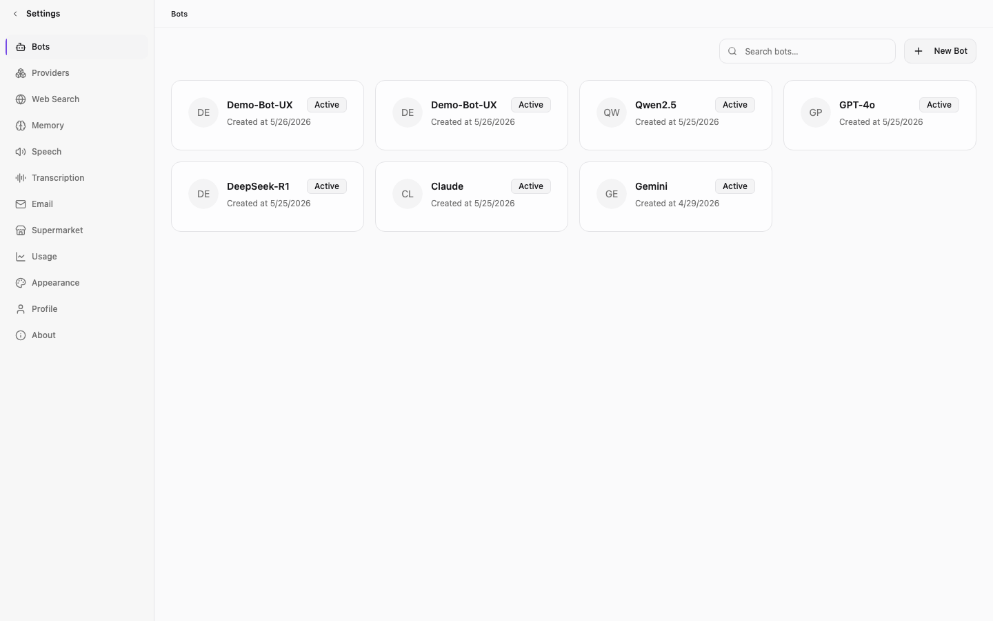
Memoh is a self-hosted AI agent manager. The interface targets high information density and flat structural borders instead of colorful, abstract cloud graphics.
The Infrastructure Metaphor
Ditching the Magic Cloud Trope
Why AI Tools Feel So Light
Most consumer AI tools hide behind glowing gradients and glass panels, trying to make machine logic feel magical. We rejected that. Memoh is infrastructure. It runs locally inside Linux sandboxes, not an abstract cloud.
The design reflects a virtual computer. Cards use pure white or deep charcoal (#121212), avoiding harsh pitch blacks. We limited the primary purple accent to just 15% of the interface. This scarcity forces the developer's attention onto monospace metadata and structural 1px grid boundaries instead of flashy action triggers.
Multi-agent nodes run inside isolated environments, mapped directly to flat frontend panels.
The Cognitive Challenge
Taming Multi-Agent Runtimes
The Sandbox Workspace
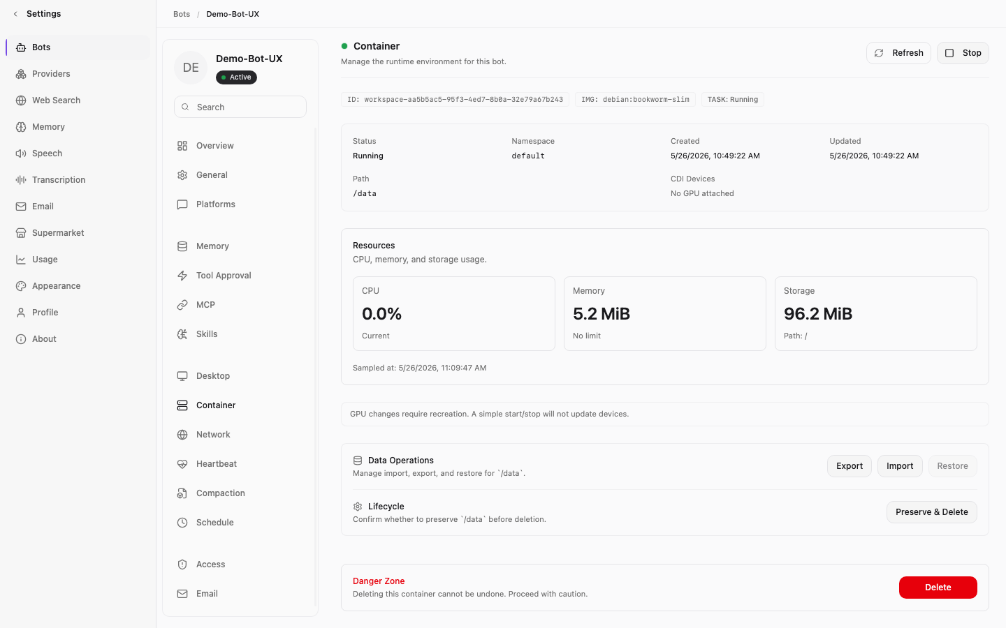
Managing active AI agents shouldn't require juggling three terminals to check Docker logs or query a database just to see what an agent is doing.
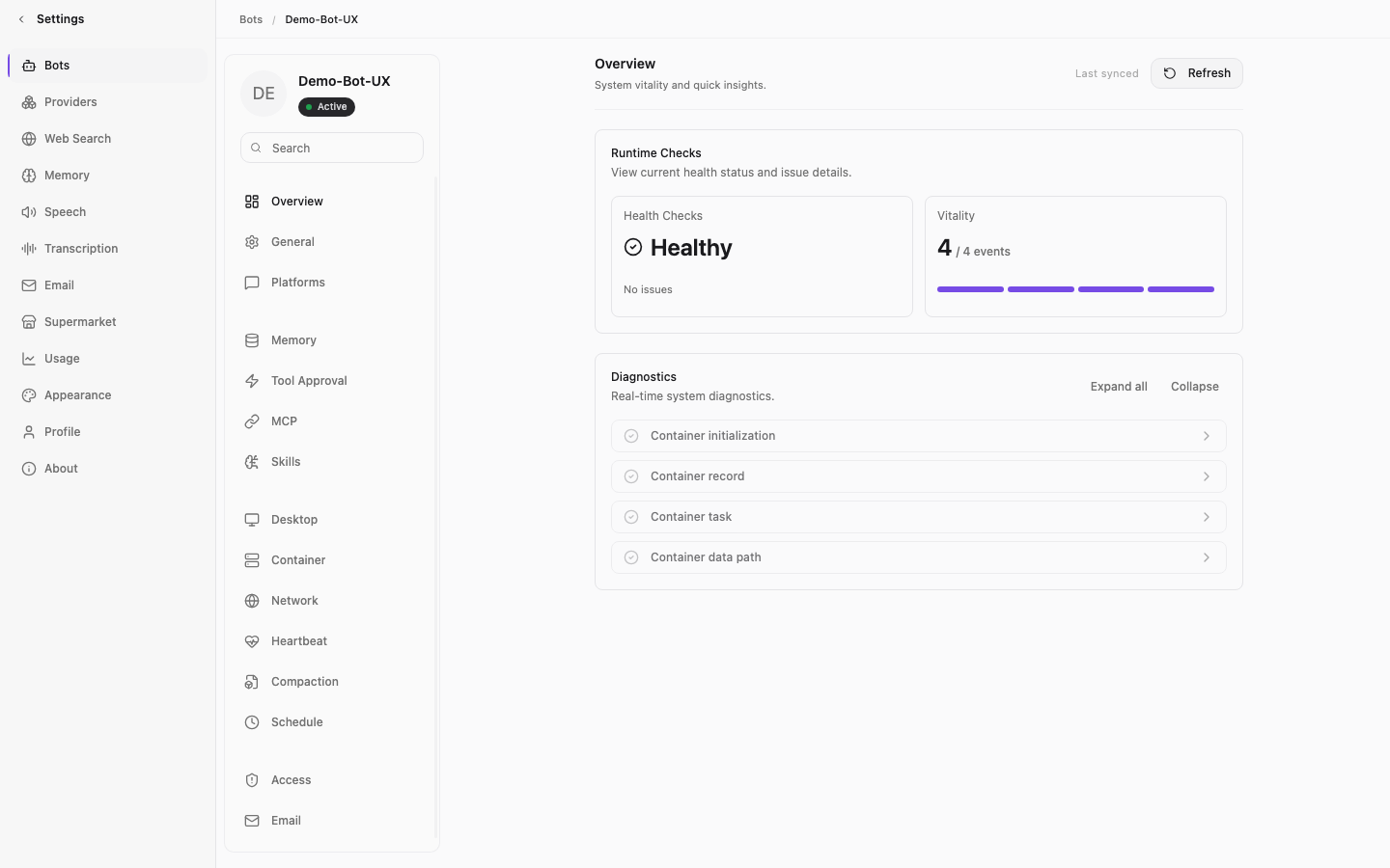
We mapped deep container states—sandbox CPU boundaries, memory limits, and MCP tool statuses—into a high-density 3-column Master-Detail system. Everything is visible at a glance.
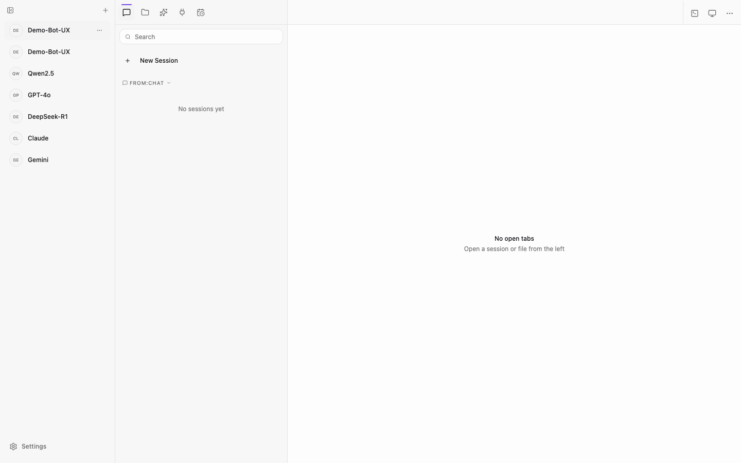
The Master-Detail grid: A fixed 240px left navigation rail (L1 sidebar) combined with a flexible conversation workspace (L2) and context sidebar (L3).
Master-Detail Layout Synchronization
Shifting columns cause visual disorientation when navigating settings. To fix this, I locked the L3 sidebar rail across all 14 sub-pages to a strict lg:flex-[0.5] lg:min-w-[230px] lg:max-w-[260px] grid constraint. Switching between MCP tools and memory rules now feels anchored and stable.
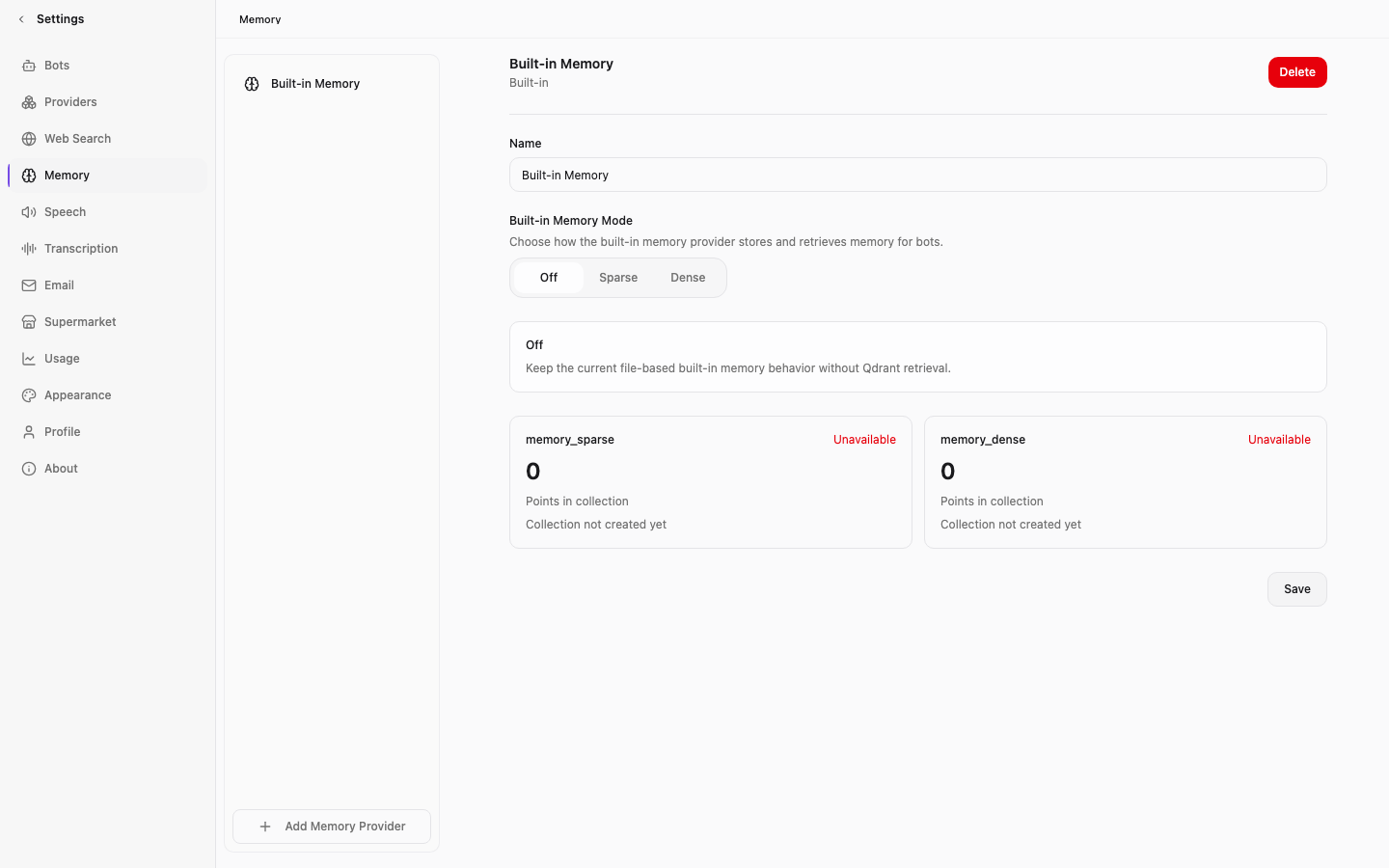
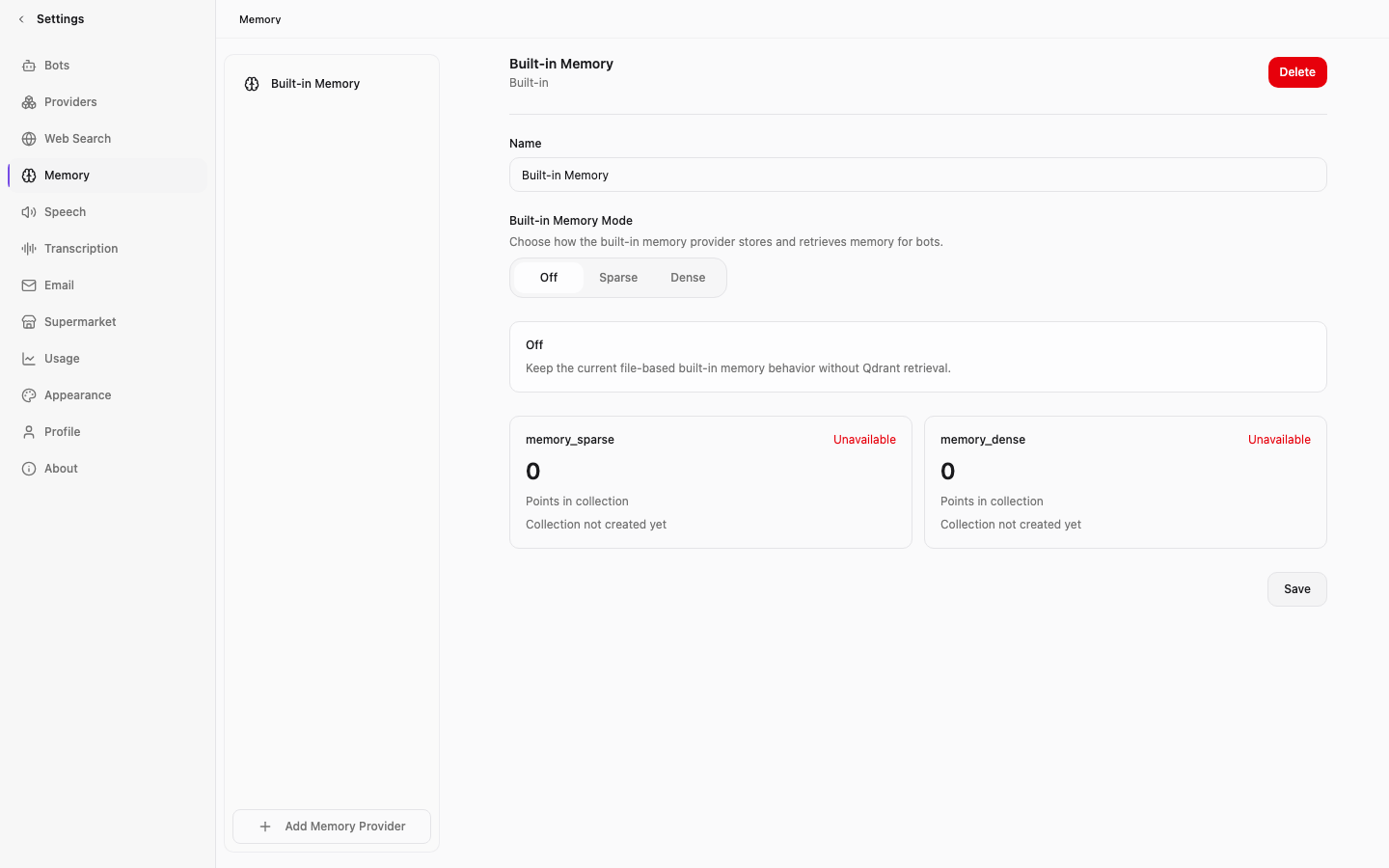
Memory engineering: The L3 context rail displays raw markdown memory blocks and active routing rules side-by-side with no container margins.
HITL Governance Redesign
Designing the Human-in-the-Loop Approval
The redesigned Approval tab: High density action cards replace raw textareas, providing strict control over agent tool triggers.
The Binary Paradox vs. Tri-State Controls
The original UI used plain textareas for Glob paths under a confusing "Must review" heading. This was dangerous. If an agent tries to run a destructive command, the system should block it immediately—not hold it in a queue where a tired operator might accidentally approve it.
We replaced this with a Tri-State segmented control:
— Auto-Approve: Silent trust for safe directories (e.g., /tmp/*).
— Require Approval: Standard queue for risky actions (e.g., editing source files).
— Silent Block: Instant denial of critical actions, saving the operator's attention.
Interactive Glob Input: Abstract paths are parsed as visual pills, letting developers audit match configurations instantly.
Defeating Syntax Catastrophes
Writing Glob patterns is error-prone. A missing star or extra space can silently expose system directories.
Inspired by the AWS IAM Visual Policy Editor, we swapped plain textareas for an interactive rule builder. Typed paths instantly wrap into visual badges and run through a background validator. The UI flags dangerous directories—like /etc/ or root paths—with inline warnings before the user saves.
Micro-adjustments: Status counters and rule metrics use high contrast monospace typography aligned to a unified Y-axis baseline.
Micro-Interactions and Aligned Metrics
Small misalignments degrade trust. In the Tool Approval card, status texts and counters sat on uneven baselines. I fixed this using tight space-y-1 stacks and stripped line heights with leading-none.
We anchored primary buttons to a sticky header. When settings change, a subtle "Unsaved changes" badge fades in next to the save button, keeping the developer informed without demanding immediate attention.
The MCP Logs panel: High-density event entries displaying live clipboard activity and system calls with stoic gray status tags.
Creative AI Workflow
Friction and Mathematical Prototyping
Spec-First Prompting
I used AI heavily to build this platform, but not by throwing vague prompts at it. Instead, I wrote detailed layout specifications in Markdown first.
By defining exact grid dimensions, font hierarchies, and border tokens upfront, we skipped the trial-and-error loop. The AI generated clean, production-ready Vue 3 components because it knew the rules.
Mathematical Animation Prototyping
The landing page features a particle canvas that routes scattered external inputs into a central core—a metaphor for how Memoh ingests data from Slack and Discord.
I wrote the particle trajectories using polar coordinate math rendered in real-time. To keep it performant on mobile, a frame-rate watcher cuts particle density in half if performance dips below 30 FPS. It also respects prefers-reduced-motion, turning off the motion entirely for sensitive users.
Self-host always-on containerized AI agent networks
https://docs.aws.amazon.com/IAM/latest/UserGuide/access_policies.html
https://code.claude.com/docs/en/permissions