May 2019 - Jun 2019
Personal Work for Portfolio/Resume
Web & Graphic Design
Digital Interface with Adobe XD
Graphic Typesetting with Adobe AI/ID
Coding with Bootstrap, Sass, jQuery
Boldstorming, the cross-medium personal identity system
The Challenges
Multi-size Devices and Print
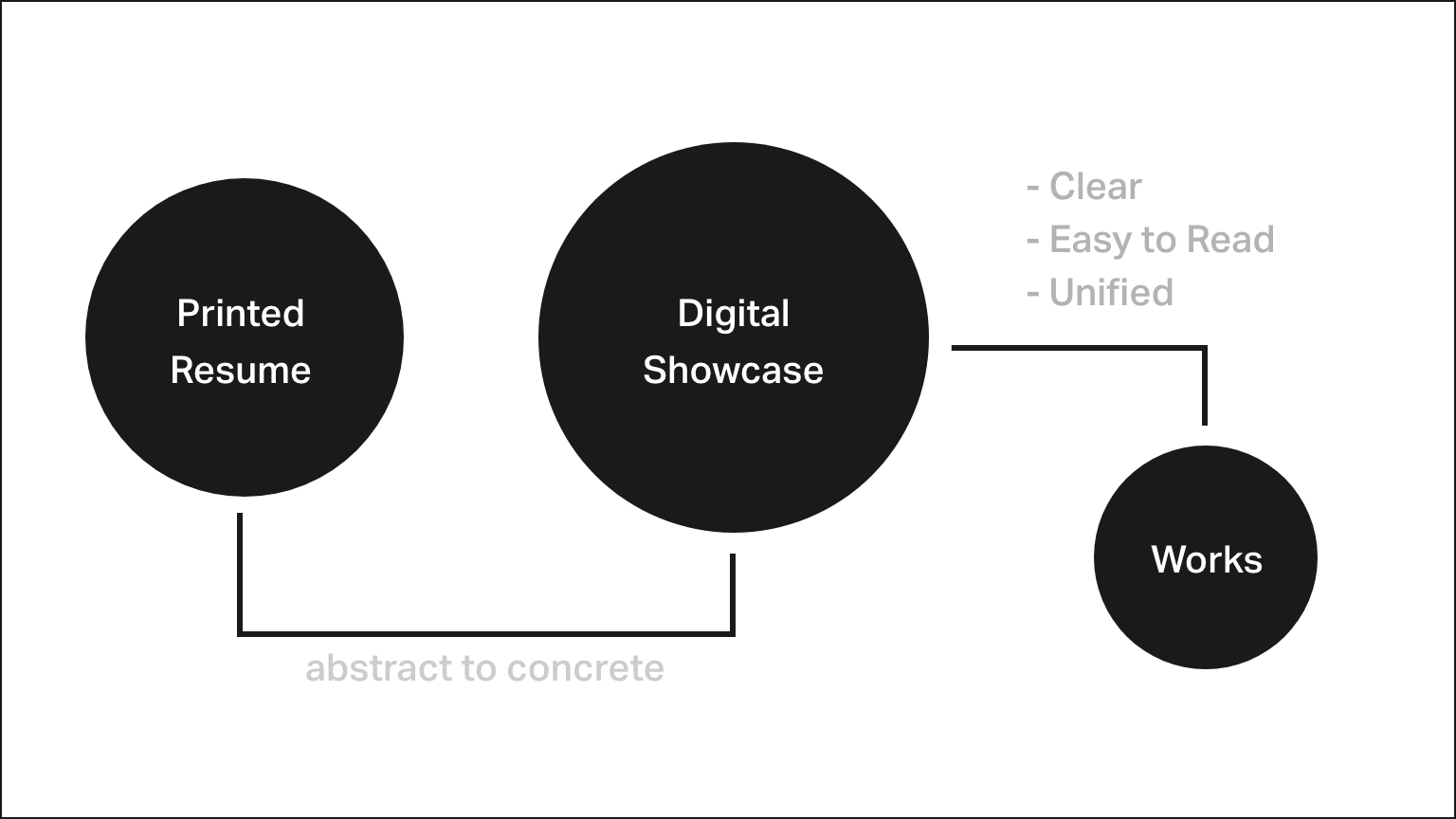
Product logic in Boldstorming
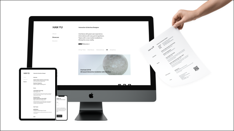
I needed an elegant physical resume for job hunting alongside a fully responsive digital portfolio to showcase my design works anytime, anywhere.
To make this visual identity bold and distinct, the core challenges were:
- Maximizing legibility to support rapid scanning by recruiters and academic reviewers;
- Designing a fully responsive portfolio using modern frontend layouts;
- Unifying the graphic design system across both physical print and digital screens.
My Role
Identity System
Cross-platform identity
To address these challenges, I designed a unified cross-platform identity system that maintains visual integrity across both physical and digital media.
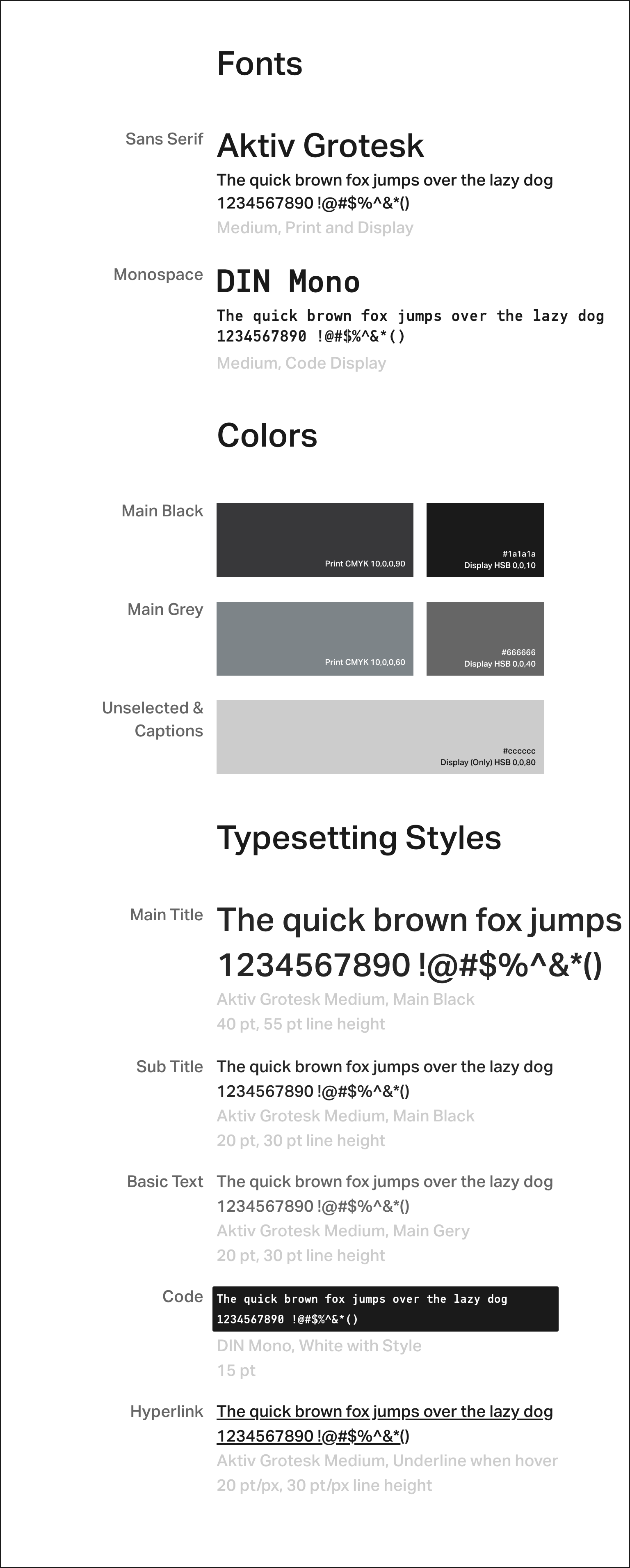
Typography, color palettes, and print typesetting layouts
Grid structures and digital interaction patterns
Methods
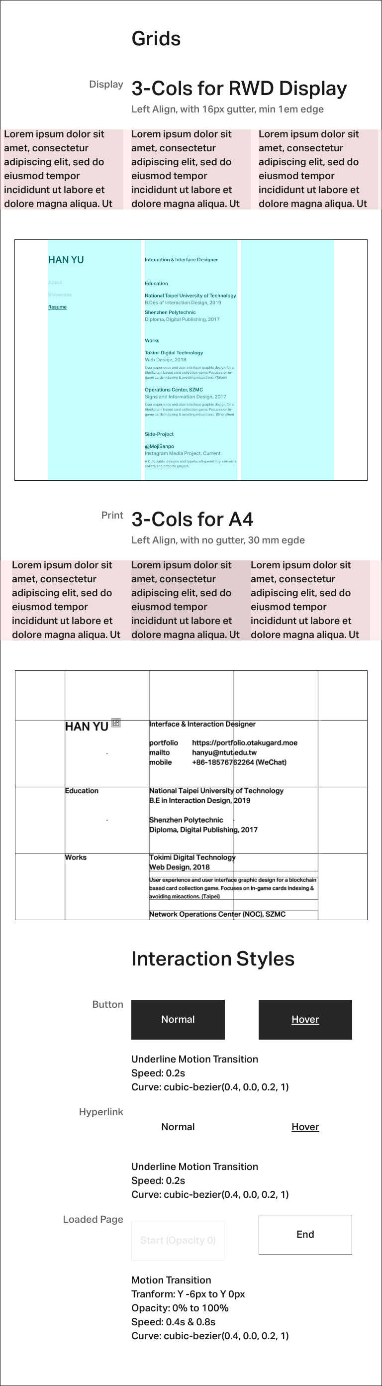
Prepress and RWD Grids
Prepress Color and the "Grey Noise" Issue
When printing fine lines and text elements using standard 4-color CMYK offsets, relying solely on black (K) ink can sometimes result in a faint, dotted, or fuzzy edge. To prevent this "grey noise" and achieve a rich, crisp black, I carefully adjusted the prepress color profile to blend a subtle percentage of Cyan (C) with the primary Black value.
Responsive Grid Translation via Bootstrap & Sass
Instead of designing static layouts for every conceivable viewport, I built an interactive prototype in Adobe XD and translated it using a customized Bootstrap grid. I scaled the default 12-column layout down to 3 columns to match the editorial, grid-aligned feel of the printed resume.
Leveraging Sass allowed me to keep styles clean, modular, and maintainable by utilizing nested rules, variables, and utility mixins.
The Final
Boom. This Site
https://material.io/design/motion/speed.html
https://getbootstrap.com/docs/4.3/layout/grid/
http://thinkingwithtype.com/text/#alignment